
Brand September 14, 2026 8 min read
What a logo has to do on a truck door
Yours has to work at sixty feet, in motion, and as a thumbnail.
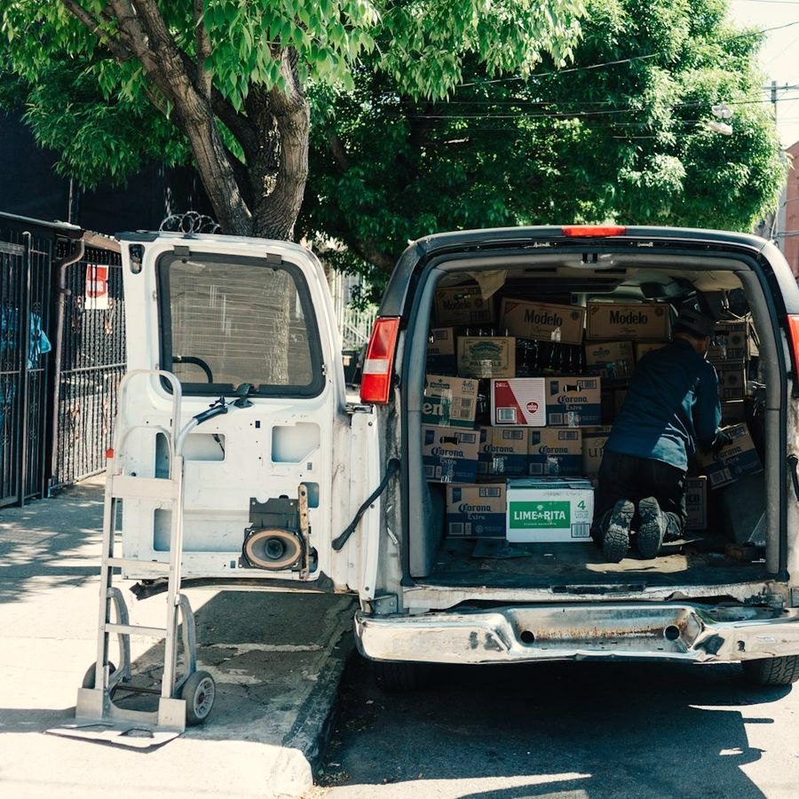
A logo usually gets approved under the best possible conditions: on a laptop, at full size, twenty inches from someone who already knows the company name and has stared at the design for three weeks.
Then it goes on a truck door, and every one of those conditions disappears.
The door is a harder test than a business card, a website header or the shop sign. It is also the most useful, because a logo that survives it works everywhere else.
The door is not the canvas
A truck or van door is rarely a clean rectangle. Working against you:
- The handle, near the middle of the usable height
- Body lines and creases through the panel
- Curvature, which foreshortens anything wrapping toward the edge
- Rivets, trim and fuel doors on the panel you were counting on
- The window line, cutting your vertical space roughly in half
The flat, uninterrupted area is almost always smaller than the door. Measure that, and design to it.
The arithmetic of being read
Sign shops work from a convention: one inch of capital letter height buys about ten feet of reading distance.
Handle that figure carefully, because it shifts with what “readable” means. Charts assuming you stop and stare put it at 25 to 30 feet per inch. The US Sign Council splits it geometrically: a legibility index of 30 for signs facing traffic head-on, 10 for signs read parallel to the driver’s line of sight. A van’s side is the parallel case, so ten is the number.
| Cap height | Read at a glance, in motion |
|---|---|
| 3 inches | about 30 feet |
| 6 inches | about 60 feet |
Now add motion. At 35 miles per hour, a vehicle covers roughly 51 feet every second.
Going from 3-inch to 6-inch letters is not about looking bigger. It buys roughly an extra second of reading, which is often the difference between a name someone registers and one they do not.
What the law settles, and who it applies to
Federal regulation (49 CFR 390.21T) requires a self-propelled commercial motor vehicle to display:
- The carrier’s legal name or a single trade name
- The USDOT number, preceded by those letters
- On both sides of the vehicle
- In letters that contrast sharply in color with the background
- Readily legible, during daylight hours, from 50 feet while the vehicle is stationary
It may be painted on, or “may consist of a removable device,” which is what makes magnetic signs legal, provided they stay legible.
Two things deserve pulling out.
There is no minimum letter height in the rule. The 50-foot daylight test is the entire specification. Anyone quoting a legally required size is quoting a convention.
It may not apply to your van. The rule covers commercial motor vehicles as the FMCSA defines them, in interstate commerce: broadly 10,001 pounds gross vehicle weight rating or more, or more than eight passengers for compensation, or placarded hazardous material. A cargo van at 9,000 pounds working one metro area falls outside on both counts. States set their own intrastate thresholds, from 10,001 pounds in California to 26,001 in Texas, so check your state rather than the federal code.
Where it does apply, it is a floor. Fifty feet, stationary, in daylight is a compliance test. Customers read the door moving, at an angle, often in poor light.
Three things, in order
The door has room for three pieces of information. Most businesses try to fit seven.
- 01Who you are. The name, at the largest size the flat panel allows.
- 02What you do, if the name does not already say it. “Harrison & Sons” tells a stranger nothing. “Harrison Plumbing” does that work for free, every time the truck passes.
- 03One way to reach you. A phone number beats a web address, because nobody types a URL from a moving car.
Everything else competes with those three: license numbers, a service list, social icons, a QR code nobody can scan at 35 miles an hour, a tagline. Each takes space from the name, and the name has to land.
A logo is not a picture of your business. It is the thing somebody has to recognize before they have decided to pay attention.
Contrast is doing more work than color
At distance, a logo stops being a shape and becomes a value: light against dark, or dark against light. This is where brand colors fail. A mid-tone on a white van, in flat afternoon light, is close to invisible from across a parking lot. The color is correct and nobody can read it.
Two checks before anything is printed:
- Convert it to grayscale. If the name goes soft, the contrast was never there, and color will not rescue it.
- Squint, or view it at 25 percent on screen. Thin strokes and hairline outlines vanish here.
Cut vinyl adds limits of its own. It is pre-colored stock cut by a blade, so gradients and soft drop shadows cannot be reproduced, and shops want a minimum stroke of about 1/16 to 1/8 inch. Below that, lines tear during weeding and lift off later.
Which is why the versions matter as much as the drawing: full color, one color, and a reversed version for dark surfaces, each supplied as a proper vector file. That is the difference between a signwriter getting on with the job and a signwriter calling you on a Tuesday morning.
And then it has to be a thumbnail
The same mark has to survive being a profile picture: a circle the size of a fingernail, next to a name nobody has read yet. That is why a logo is rarely one drawing. You want the full lockup for the door and the letterhead, and a reduced icon — usually one element from the full mark — for everywhere small and square.
If the icon is just the lockup shrunk, it will not work. It has to be drawn for that size on purpose.
The same mark, everywhere
The quiet failure is drift. The van has one version, the website has another, the shirts have a third because that was the file somebody could find. Each one is fine on its own, and together they read as three small businesses rather than one established one.
That is what guidelines and a tidy set of files are actually for. Not ceremony — consistency, on the days you are not the one placing the logo.
Test it before you commit
It can be settled in an afternoon:
- 01Print the design at actual size and tape it to the vehicle.
- 02Walk 60 feet away and read it.
- 03Photograph it from there, then convert the photo to grayscale.
- 04Show that photo to someone who has never heard of the company and ask what the business does.
If step four fails, no wrap budget fixes it afterward.
A truck door is unforgiving in ways a screen never is, and that is exactly why it is worth designing for first. Something that holds up at sixty feet, in motion, in a single color is going to be fine on a business card.
Sources
Federal vehicle marking
- Marking requirements, the operative section. 49 CFR 390.21T, eCFR
- The renumbered section, suspended indefinitely since 2019. 49 CFR 390.21, eCFR
- Definition of “commercial motor vehicle,” including the weight, passenger and hazmat thresholds and the interstate commerce requirement. 49 CFR 390.5T, eCFR
- State intrastate thresholds, including California and Texas. Intrastate DOT Requirements by State, TIPRO Services
Letter height and legibility
- Legibility index of 30 for perpendicular signs and 10 for parallel signs. The research-grounded source in this area. Guideline Standards for On-Premise Signs, US Sign Council Foundation
- Letter height charts distinguishing maximum readability from best impact. Sign Letter Height Visibility Chart, Signazon
- Maximum versus comfortable reading distance per inch of cap height. Letter Height Visibility Chart, Pannier Graphics
- The ten-feet-per-inch convention stated as best impact rather than maximum. Sign Letter Height Visibility 101, VisualPro
Cut vinyl reproduction
- Cut vinyl is pre-colored sheet stock and cannot reproduce gradients. Digital Print vs Cut Vinyl, MPL Signage
- Printed vinyl as the route to gradients and wider color. Print Vinyl vs Cut Vinyl, Sign Outlet Store
- Practical minimum stroke width, from working signmakers: “If it is less than 1/16” we will not warranty the job.” Cut: How Thin Lines, Signs101
- Hairline serifs and thin strokes tearing and lifting during weeding. Best Font for Small Vinyl Cutting, TeckWrap